It happened two weeks ago. I was stuck in traffic on my way to the beach, on one of those days when the capital city of Portugal decides to sizzle at 34 °C, and the only cure is to escape across the Tejo. We were driving over the Vasco da Gama Bridge, windows down, music on, when a friend of mine, a designer and UX/UI specialist, casually dropped a word that completely caught me off guard: skeuomorphism. I’d never heard it before, let alone understood what it meant. He smiled and said, “You’re going to love this concept.” And he was right. From that moment on, the word echoed in my mind like a silent notification I couldn’t snooze.
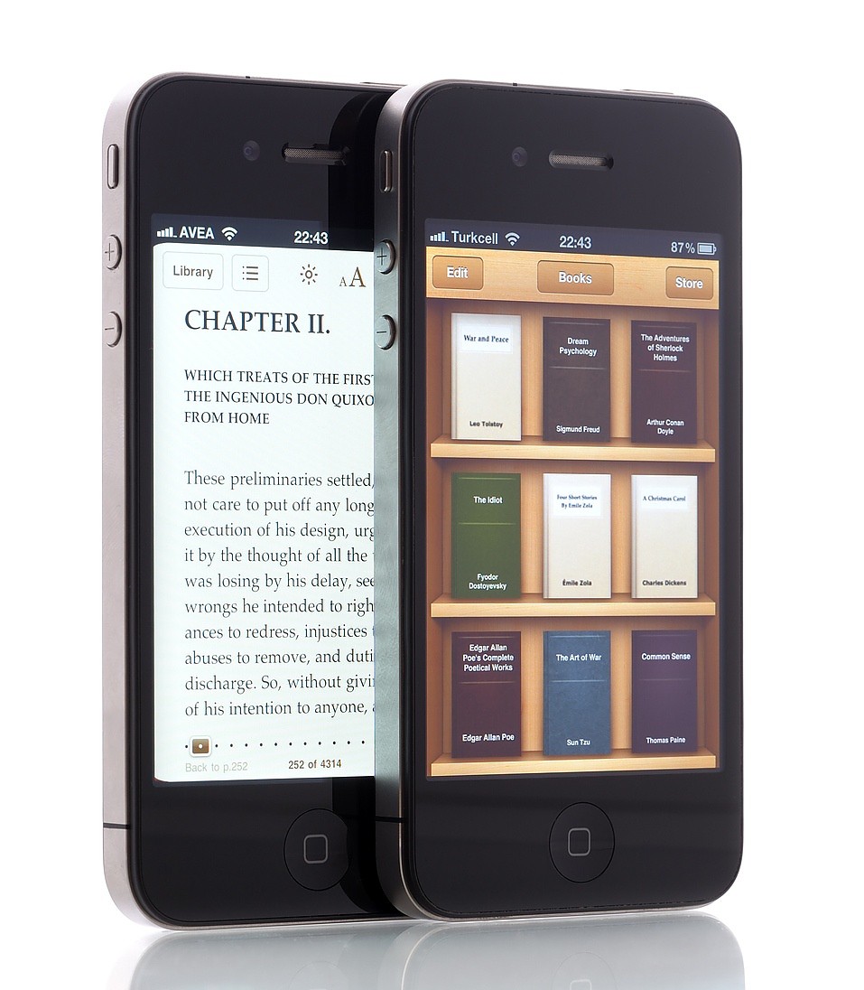
Skeuomorphism is a design principle that seeks to imitate or replicate the forms, materials and textures of the physical world in the digital universe. Remember those old icons that looked just like a Moleskine planner, a radio button, or a wooden bookshelf? That’s skeuomorphism, the digital world trying to comfort us through familiarity. This visual style peaked during the early days of smartphones, especially with Apple’s iOS. The idea was simple: by referencing real-world objects and textures — think leather, shadows, visual toggles and knobs — users would feel more at home in what was still a relatively new environment. For a while, skeuomorphism was the perfect bridge between the physical and digital worlds.
But, like all trends, it faded. Over time, skeuomorphism gave way to a new visual philosophy: flat design. A radical aesthetic shift that brought with it a visual manifesto, a rejection of excess, a purging of form. Flat surfaces, solid colours, two-dimensional icons, clean typography and zero depth. A minimalist counter-movement that elevated simplicity to a kind of visual vow of silence. Flat design swept in to strip away the temptations of visual overload, it cleaned our screens to the bone. For years, it reigned supreme: modern, practical, elegant. Until now.
Something is shifting, and not just in design. Our relationship with digital is also changing. After years of living inside flat, sterile screens, it feels like we want to feel again. As users, we’re craving texture, nuance, and a kind of visual comfort that wraps us in a soft sense of realism and nostalgia.
And it’s in this nostalgic yearning for the tangible that skeuomorphism makes its comeback, subtler than a Cornetto Perna the Pau reappearing on Olá a summer menu. It’s recognisable, yes, but now it comes with new rules. More sophisticated. More mature. Reinvented, and always with just the right dose of nostalgia.
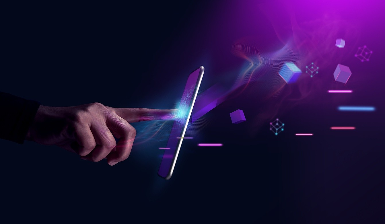
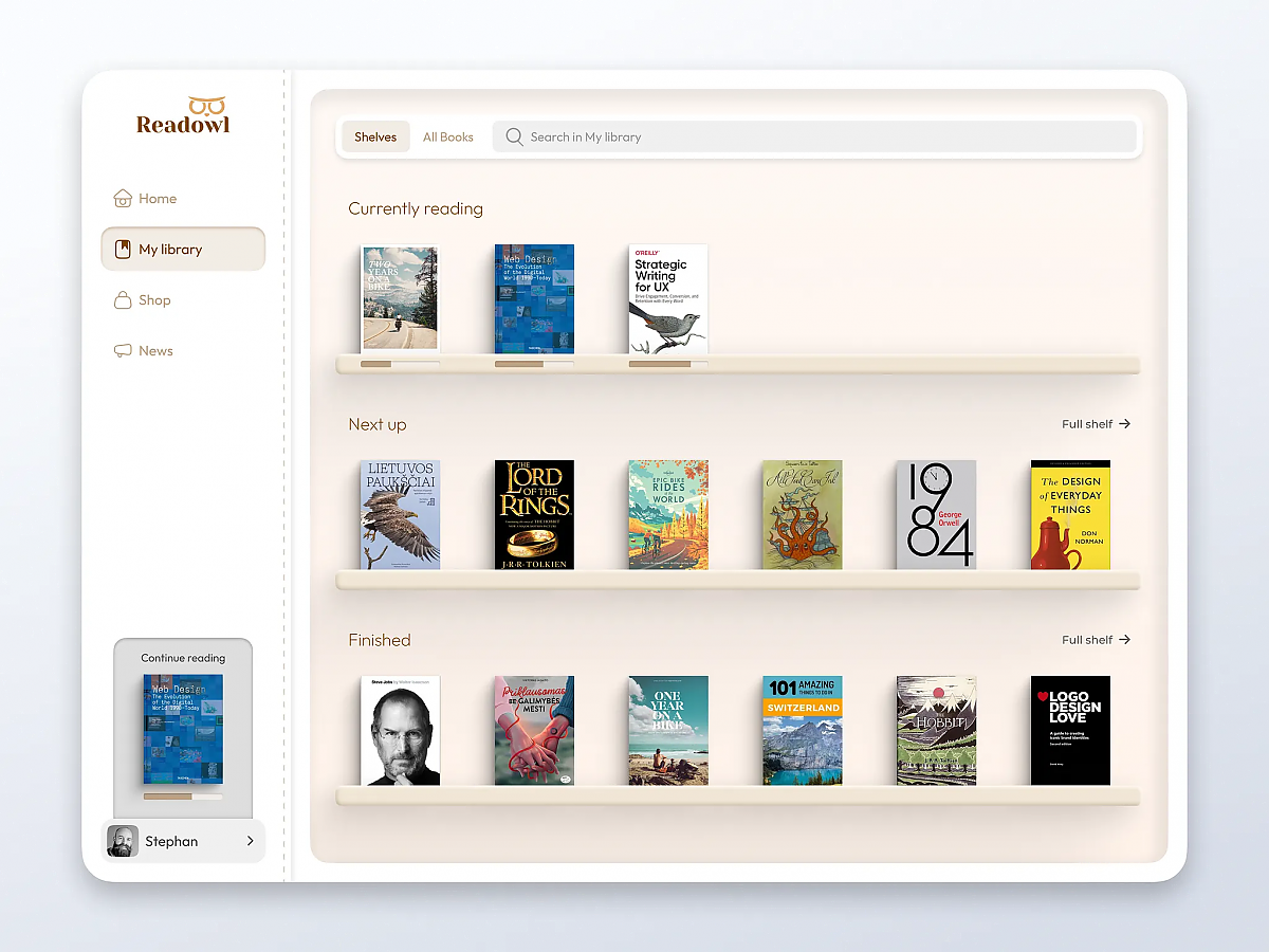
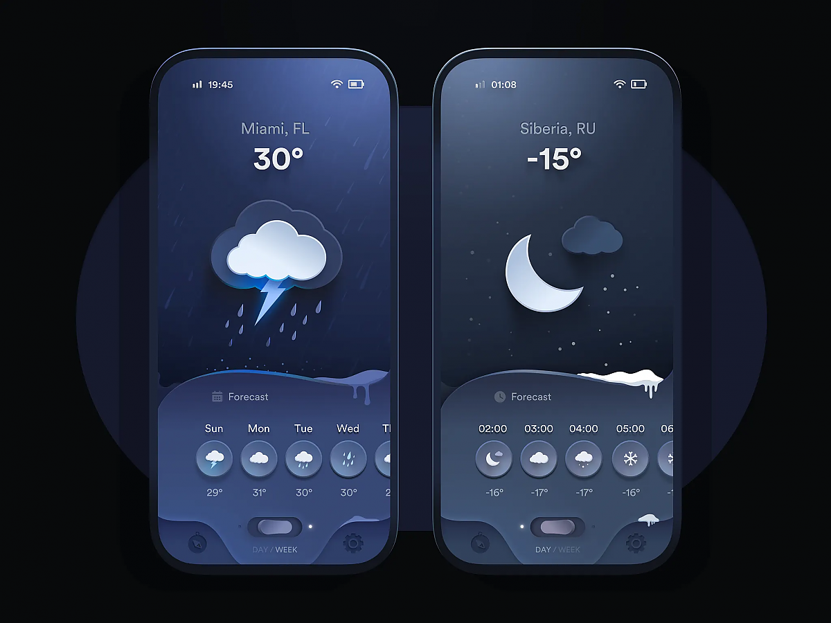
This revival is far from forced. It’s appearing in a new, quieter, more evolved, more tactile form. Though the design community hasn’t fully aligned on what to call it, many refer to it as neo-skeuomorphism. And here we are, in 2025, witnessing the return of materiality, not through clutter or kitsch, but through depth, glow, texture, and volume in ways that feel almost... sensorial.
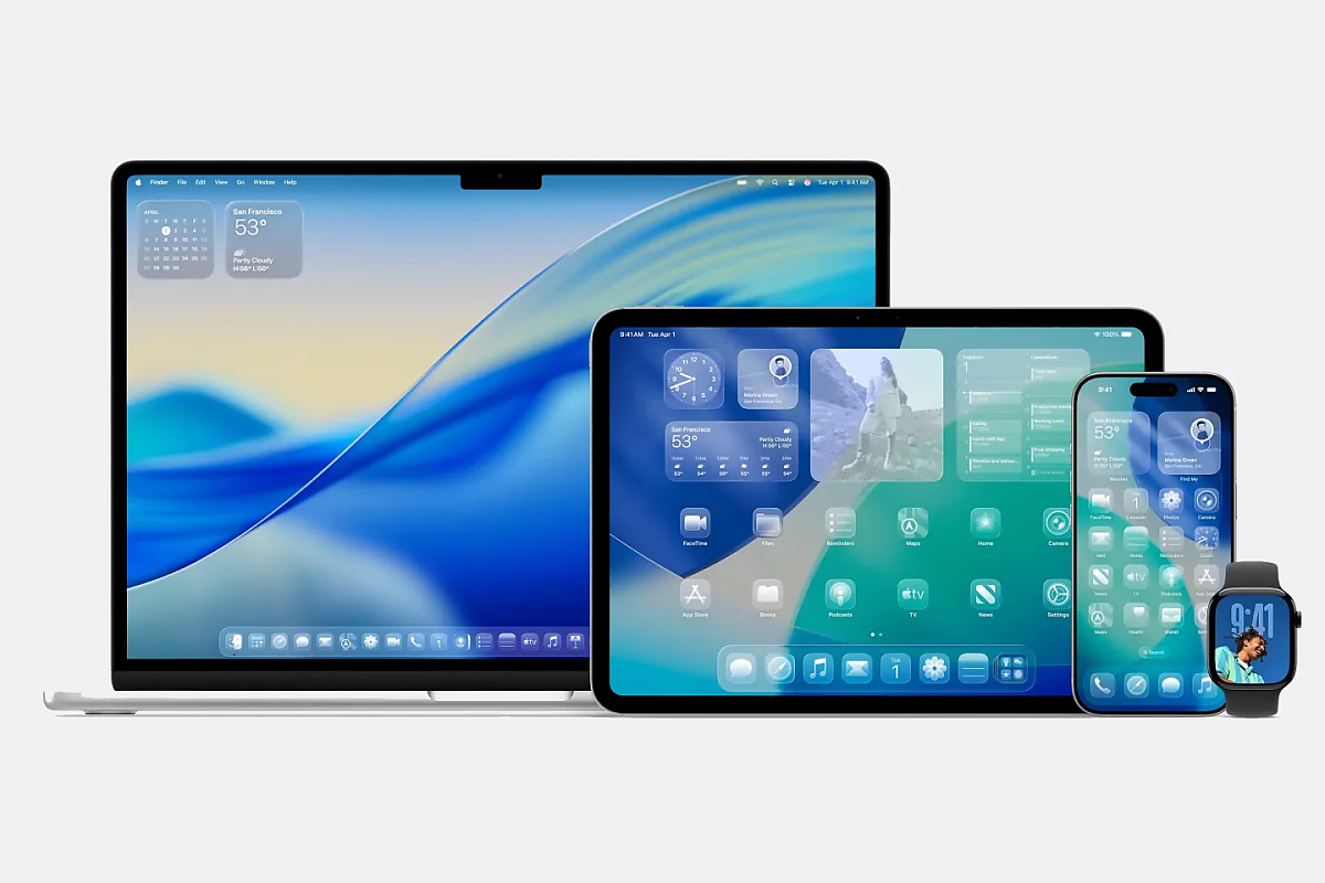
ake Apple’s new operating system, for instance. It revives this aesthetic and, in typical Apple fashion, scales the concept to a new level. Their liquid glass UI introduces depth, shine, reflection and translucent layers with an elegance that feels quite literally fluid.
Another example? The recent Repsol rebrand. Their new logo brings back shine, relief and volume, evoking physical materials with a level of sophistication we hadn’t seen in years.
Just last night, on the eve of this blog post, I noticed Airbnb’s updated design system. Major changes to buttons, transparencies, and iconography. And it’s all making its way into their website. Textures are back. The leather on vintage travel bags. The fuzz on animal paws. The wood grain of the bedframe. Tiny visual cues that suggest a world we can almost touch.
Maybe it’s just me - or maybe it’s the side effect of being so hooked on this topic since that beach trip - but I think I’m starting to see echoes of this trend creeping into more and more websites. Just little things: icons with volume, menus with faint transparency, lighting effects hinting at depth… As if the digital is slowly relearning how to touch us.
It might be too early to draw big conclusions, but it feels like this neo-skeuomorphism isn’t just about copying the physical world, it’s about creating a new visual language that’s richer, more sensorial, more intuitive. Something between the tangible and the imagined.
And that genuinely excites me! Because for anyone who works with or thinks about digital, it’s impossible not to wonder: what will it be like to see this trend take shape across websites? How will it transform navigation, UX/UI, storytelling, even digital branding itself?
Now that I know neo-skeuomorphism isn’t the name of a multivitamin, I can’t wait to see how this new digital texture will unfold, as the future slips through our fingers… and across our trackpads.